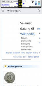
On a fine day in early March 2020, I was notified by an administrator of Indonesian Wikipedia that the site looks horrible on mobile web!

Oh my gosh, I remembered that it didn’t use to look like that!
So I searched in the Internet Archive to prove my memory.

It’s true then. Something must have recently been changed in the MediaWiki software (or the configuration of it) that causes this issue!
After some time of searching, I encountered on the Wikimedia Foundation’s Phabricator this task about removing the codes on handling the render of main page specially on mobile web. Instead of doing a special render, the mobile web main page will now just be another skinned version of the site’s main page.
This poses a huge problem of Indonesian Wikipedia.
That is because the Indonesian Wikipedia’s main page design, which was adopted by the community in early 2014, heavily uses <table> to style the layout! This is why the page, if left as is, looks horrible on mobile web. What happened back then was that the MediaWiki software itself extracted the content of the main page (with some special codes) and render a different version of it in mobile view.
To fix this issue, I had two ideas:
- Rewrite the current main page without relying on
<table>, or - Contact someone in the Wikimedia Foundation to rollback the site configuration change
Since the effort of #1 is huge, I did #2 first, by filing a strongly-worded “complaint” ticket in Phabricator. Unfortunately, they didn’t respond fast enough (they only responded today, few days after I deployed my solution #1).
After filing that ticket, knowing from experience that my request won’t be looked at immediately, I started on solution #1, which is a rewrite of the main page. Over the next few hours (and continued on the next night), I rebuild the main page from ground up. I dumped table and replace it with Flex box, so that it will look nice on mobile view.
The main challenge, as it turns out, is actually on the main page’s header section.

This header section consists of a logo, a welcome message, statistics, and list of portals. The logo itself is a background image, while the welcome message welcomes you to Wikipedia, with a subtitle describing what Wikipedia is. It is subtle, but the subtitle has a small spacing so that it doesn’t crosses into the logo.
The development of this main page mainly happens on VS Code! This is because Wikitext editor on the site focuses more on the actual content rather than HTML codes. Besides that, on VS Code, if I treat Wikitext as HTML, I get auto-formatting from Prettier! I had to be careful though, as introducing extra line break means different thing in the Wikitext parser: it treats extra line break as inserting a new paragraph. That is why my final codes are full of HTML comments 😂

I finished the whole rewrite on Friday night (6 March) and informed the community to check my result. As expected, no one complained, and I proceeded to apply the change on Monday morning (9 March). Now the site looks good again on mobile 😁

In retrospect, I think there has been a lack of communication of the engineers in Wikimedia Foundation with the community, especially on highlighting breaking changes like this. I did subscribe to all the channels and tech mailing list that they recommend. After some searches, I actually did found a mention on this issue in the previous week’s edition of Tech News, but it wasn’t properly highlighted as a major breaking change and it slipped past me. Oh well 😅